Under the name חומש עבריא you can download a Hutter Bible in four volumes (Pentateuch, Early Prophets, Later Prophets, and Hagiographa). This is not the first edition of the Hutter Bible, rather this was the fourth edition printed in Cologne in 1603. Here you can see a set (bound in one volume) offered for sale for $6500. So a great thanks is owed to the YIVO Institute for Jewish Research which allowed Hebrewbooks to scan their copy, and to Hebrewbooks itself for making it available.
Dr. S. Z. Leiman describes this Bible in this post at Seforim:
Elias Hutter (circa 1553-1609), a pious Christian, studied Oriental languages at the University of Jena and was appointed Professor of Hebrew at the University of Leipzig. His fame rests not so much on his scholarly research as it does on his career as an editor and publisher. He published a series of polyglot editions of the Bible, as well as editions of the Hebrew Bible alone. He is perhaps most famous for his Hamburg, 1587 edition of the Hebrew Bible. Usually bound in one thick folio volume, it is distinguished by the large font he used for the Hebrew letters. Moreover, he printed the root letters of every Hebrew word in the Bible in thick, heavily inked font. In contrast, he printed the non-root letters (such as “vav” copula “and”; or “vav” consecutive, which changes the tense of the verb) in a hollowed-out outline form. Thus, he introduced a major educational tool where a simple glance at the printed biblical text enabled the reader to recognize the root letters of any Hebrew word.The title page itself describes it in a Latin which is not hard to understand:
BIBLIA
EBRAEA
Eleganti er Maiu-
scula Characterium For-
ma, qua ad facilem sanctae linguae & scri-
pturae intelligentiam primo sta-
tim intuitu literae
RADICALES & SERVILES,
DEFICIENTES & QVIESCENTES, &c. situ & colore discer-
nuntur.
EBRAEA
Eleganti er Maiu-
scula Characterium For-
ma, qua ad facilem sanctae linguae & scri-
pturae intelligentiam primo sta-
tim intuitu literae
RADICALES & SERVILES,
DEFICIENTES & QVIESCENTES, &c. situ & colore discer-
nuntur.
Here is a sample page (it's not printed on blue paper. I like blue, so my revisionist image is blue, as they often are):

The brilliance of this simple, yet potent idea has not diminished in 400 years. I'm sure it would be interesting to examine it carefully and catch mistakes, or at least which etymological interpretation Hutter accepted in cases of controversies about roots.
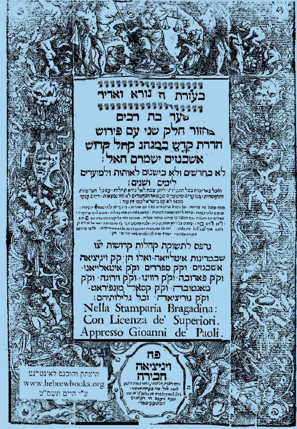
Also, there's one volume of an Italian machzor printed in 1711 in Venice. How's this for a title page?

Turns out I had already photographed this title page (see here):

When the Days of Awe approach and it's time to open up the machzor, that title page will scare anyone straight!
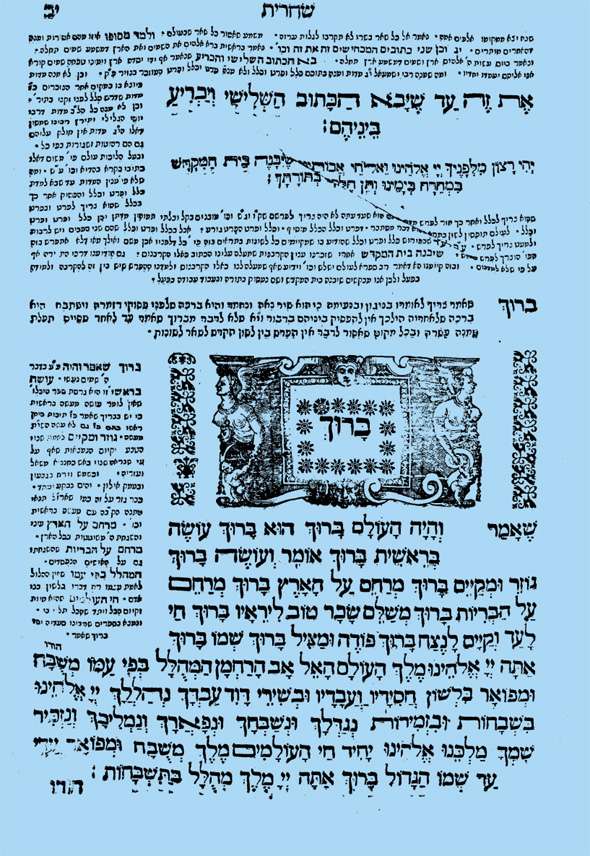
Then as you begin shacharis:

These nymphs, or whatever the technical term for them are, look . . . cold.
